const CardExample = () => {
  return (
    <Card>
      <Heading as="h2" variant="heading20">
        Parable of the Talents
      </Heading>
      <Paragraph>
        Choose your leaders with wisdom and forethought. To be led by a coward is to be controlled by all that the
        coward fears. To be led by a fool is to be led by the opportunists who control the fool. To be led by a thief is
        to offer up your most precious treasures to be stolen. To be led by a liar is to ask to be lied to. To be led by
        a tyrant is to sell yourself and those you love into slavery.
      </Paragraph>
      <Paragraph marginBottom="space0">
        —
        <Anchor href="https://www.goodreads.com/book/show/60932.Parable_of_the_Talents">Octavia Butler</Anchor>
      </Paragraph>
    </Card>
  );
};

render(<CardExample />);Cards are specifically-styled containers that group related content and actions. Cards are a great tool for placing a concise amount of related information together in one object, much like a business card or baseball card in real life.
Card is an extremely flexible container that does not require specific components inside of it. You can compose a Card to support your use case, but elements such as Heading, Paragraph, and Button or Anchor are commonly used.
A Card does not handle any interactive events such as hover, click, or focus, though children composed inside of it may commonly have event handlers.
Acknowledging the flexibility of Card component, there are several non-negotiable properties of a Card that differentiate it from a more basic page-layout element, such as Box including background color, border width, border radius, and border color.
At its core, Card is a Box with specific styling attributes and more explicit use cases that you can find in Examples. If you find yourself limited by the default styling and constraints of a Card, you may consider using a Box instead, but first consider bringing the problem you are trying to solve to Design System Office Hours to see if another component or pattern could fit your needs.
By default, a Card has space100 padding, which can be adjusted with padding props and spacing tokens.
const CardExample = () => {
  return (
    <Card>
      <Heading as="h2" variant="heading20">
        Parable of the Talents
      </Heading>
      <Paragraph>
        Choose your leaders with wisdom and forethought. To be led by a coward is to be controlled by all that the
        coward fears. To be led by a fool is to be led by the opportunists who control the fool. To be led by a thief is
        to offer up your most precious treasures to be stolen. To be led by a liar is to ask to be lied to. To be led by
        a tyrant is to sell yourself and those you love into slavery.
      </Paragraph>
      <Paragraph marginBottom="space0">
        —
        <Anchor href="https://www.goodreads.com/book/show/60932.Parable_of_the_Talents">Octavia Butler</Anchor>
      </Paragraph>
    </Card>
  );
};

render(<CardExample />);You can set non-default padding on all sides of a Card.
const CardExample = () => {
  return (
    <Box maxWidth="size40">
      <Card padding="space0">
        <Box padding="space160" display="flex" justifyContent="center">
          <AlertsAndNotifications />
        </Box>
        <Separator orientation="horizontal" verticalSpacing="space0" />
        <Box paddingY="space60" paddingX="space90">
          <Heading as="h2" variant="heading40">
            Alerts and notifications
          </Heading>
          <Paragraph>
            Inform, engage, and drive customers to take action. Deliver reliable multichannel notifications through
            Twilio.
          </Paragraph>
          <Button variant="secondary" size="small">
            Try notifications
          </Button>
        </Box>
      </Card>
    </Box>
  );
};

render(<CardExample />);One of the most common use cases for a Card is to relate a title (Heading), supporting body copy (Paragraph), and primary action (Button) together. Relating these three elements together with a Card makes it easy for a user to digest and provides a clear call to action.
const CardExample = () => {
  return (
    <Stack orientation="vertical" spacing="space40">
      <Card padding="space120">
        <Heading as="h2" variant="heading20">
          The Transgender District
        </Heading>
        <Paragraph>
          The mission of the Transgender District is to create an urban environment that fosters the rich history,
          culture, legacy, and empowerment of transgender people and its deep roots in the southeastern Tenderloin
          neighborhood. The transgender district aims to stabilize and economically empower the transgender community
          through ownership of homes, businesses, historic and cultural sites, and safe community spaces.
        </Paragraph>
        <Button variant="primary" as="a" href="https://www.transgenderdistrictsf.com/">
          Support The Transgender District
        </Button>
      </Card>
      <Card padding="space120">
        <Heading as="h2" variant="heading20">
          Inside Out
        </Heading>
        <Paragraph>
          Inside Out empowers, educates, and advocates for LGBTQ+ of youth from the Pikes Peak Region in Southern
          Colorado. Inside Out does this by creating safe spaces, support systems and teaching life skills to all youth
          in the community and working to make the community safer and more accepting of gender and sexual orientation
          diversity.
        </Paragraph>
        <Button variant="primary" as="a" href="https://insideoutys.org/">
          Support Inside Out
        </Button>
      </Card>
      <Card padding="space120">
        <Heading as="h2" variant="heading20">
          The Audre Lorde Project
        </Heading>
        <Paragraph>
          The Audre Lorde Project is a Lesbian, Gay, Bisexual, Two Spirit, Trans and Gender Non Conforming People of
          Color center for community organizing, focusing on the New York City area. Through mobilization, education and
          capacity-building, they work for community wellness and progressive social and economic justice. Committed to
          struggling across differences, they seek to responsibly reflect, represent and serve their various
          communities.
        </Paragraph>
        <Button variant="primary" as="a" href="https://alp.org/">
          Support The Audre Lorde Project
        </Button>
      </Card>
    </Stack>
  );
};

render(<CardExample />);Use these layouts when you need to draw customers’ attention to upsell and cross-sell opportunities. Use them sparingly, mainly when they’ll help customers solve immediate problems.
Research insight on marketing and cross-selling
Research from Twilio has shown that cross-sell cards aren’t useful when the developers are in the product focused on urgent problems. They’re likely to ignore these cards, regardless of how they’re presented, until they’re relevant to a current project they’re working on.
To create a marketing Card, start by layering items from the top of this list. Add or remove items as you work your way down to create the right level of emphasis for your card:
- Place the content at the top of the page.
- Add more padding than other text content or Cards around it. Start with
space-130and size up in 8px increments from there. - Add an illustration.
- If you’re cross-selling across platforms (e.g., Segment, SendGrid, Communications, Flex), add a brand Badge.
Most marketing content in the product is a suggestion to customers. As you layer items from the list, make sure you’re not distracting from their main goals on a page. A marketing Card should catch a customer’s attention but not at the expense of everything else in the flow.
Don’t use everything in the list at once. If your marketing content is not the main content of a page, use 1-2 items. If it is the main content, use no more than 3 items.
You might even find out that you don’t need to put your content in a Card. To emphasize the content without using Card, use Box and color-background-weak.
Examples that use more padding and illustrations:
const CardExample = () => {
  return (
    <Card>
      <MediaObject verticalAlign="top">
        <MediaFigure spacing="space90">
          <Box as="img" src="./card/marketing1.png" maxHeight="150px" />
        </MediaFigure>
        <MediaBody>
          <Heading as="h6" variant="heading30">
            Transform your unstructured voice data into actionable insights
          </Heading>
          <Paragraph>Get accurate transcriptions, and use AI-powered language operators.</Paragraph>
          <Button variant="primary">
            Discover Voice Intelligence <ArrowForwardIcon decorative />
          </Button>
        </MediaBody>
      </MediaObject>
    </Card>
  );
};

render(<CardExample />);const CardExample = () => {
return (
<Card>
<MediaObject verticalAlign="top">
<MediaFigure spacing="space90">
<Marketing2 />
</MediaFigure>
<MediaBody>
<Heading as="h6" variant="heading30">
Multi-channel user verification
</Heading>
<Paragraph>
Verify is a fully managed API for multichannel user verification. And it now includes guaranteed protection
from SMS pumping fraud with Fraud Guard.
</Paragraph>
<ButtonGroup>
<Button variant="primary">
Start building <ArrowForwardIcon decorative />
</Button>
<Button variant="secondary">
Learn more <LinkExternalIcon decorative />
</Button>
</ButtonGroup>
</MediaBody>
</MediaObject>
</Card>
);
};
render(<CardExample />);An example that uses illustrations and a marketing Badge:
const CardExample = () => {
  return (
    <Card>
      <MediaObject verticalAlign="top">
        <MediaFigure spacing="space40">
          <Marketing3 />
        </MediaFigure>
        <MediaBody>
          <Box paddingBottom="space70">
            <Badge as="span" variant="brand30">
              <ProductSegmentIcon decorative />
              Twilio Segment CDP
            </Badge>
          </Box>
          <Heading as="h6" variant="heading10">
            Know your customers personally with Twilio Segment
          </Heading>
          <Paragraph>
            You can now use your Twilio credentials to log in and explore Segment, our customer data platform. Combine
            data across the customer lifecycle into a single, golden profile with our CDP.
          </Paragraph>
          <Button variant="secondary">Log in to Segment with Twilio</Button>
        </MediaBody>
      </MediaObject>
    </Card>
  );
};

render(<CardExample />);
An example that doesn't use Card at all:
const CardExample = () => {
  return (
    <Box
      display="flex"
      flexDirection="column"
      backgroundColor="colorBackground"
      paddingY="space120"
      paddingX="space180"
      borderRadius="borderRadius30"
    >
      <Box width="100%" display="flex" justifyContent="center">
        <Marketing4 />
      </Box>
      <Box>
        <Heading as="h6" variant="heading10">
          Turn your recordings into transcriptions
        </Heading>
        <Paragraph>
          Next steps: Turn your voice recordings into transcripts and extra insights such as key phrases and compliance
          issues with Voice Intelligence.
        </Paragraph>
        <Button variant="primary">
          Discover Voice Intelligence <ArrowForwardIcon decorative />
        </Button>
      </Box>
    </Box>
  );
};

render(<CardExample />);
If these options don’t work for your use case and you need to create something custom, request a creative review with the Brand team and partner with them to make sure it aligns with Twilio’s brand guidelines.
Use this layout to show a group of Cards with pricing plans. Use a brand Badge to highlight a “recommended” plan and decorative Badges for a customer’s current plan.
The text layout in each Card is a suggestion. Adjust it as needed for your use case.
const CardExample = () => {
  return (
    <Box display="grid" gridTemplateColumns="repeat(2, 1fr)" columnGap="space60">
      <Card paddingY="space100" paddingX="space70">
        <Badge as="span" variant="success">
          Current plan
        </Badge>
        <Box textAlign="center" marginTop="space70">
          <Box width="100%" display="flex" justifyContent="center">
            <Avatar icon={UserIcon} name="free plan" size="sizeIcon90" />
          </Box>
          <Box marginY="space30">
            <Heading as="h6" variant="heading30">
              Free
            </Heading>
          </Box>
          <Paragraph marginBottom="space0">$0 / month</Paragraph>
          <Box marginTop="space70">
            <Button variant="secondary">Contact us to change plan</Button>
          </Box>
          <Separator orientation="horizontal" verticalSpacing="space70" />
          <Box textAlign="left" display="grid" gridTemplateRows="repeat(4, min-content)" rowGap="space30">
            <Paragraph marginBottom="space0">
              <Box display="flex" columnGap="space20">
                <AcceptIcon color="colorTextIconAvailable" decorative />
                10 seats
              </Box>
            </Paragraph>
            <Paragraph marginBottom="space0">
              <Box display="flex" columnGap="space20">
                <AcceptIcon color="colorTextIconAvailable" decorative />
                3 sources
              </Box>
            </Paragraph>
            <Paragraph marginBottom="space0">
              <Box display="flex" columnGap="space20">
                <AcceptIcon color="colorTextIconAvailable" decorative />
                1 warehouse destination
              </Box>
            </Paragraph>
            <Paragraph marginBottom="space0">
              <Box display="flex" columnGap="space20">
                <AcceptIcon color="colorTextIconAvailable" decorative />
                10,000 MTU
              </Box>
            </Paragraph>
          </Box>
        </Box>
      </Card>
      <Card paddingY="space100" paddingX="space70">
        <Badge as="span" variant="brand10">
          <LogoTwilioIcon decorative />
          Exclusively available to you
        </Badge>
        <Box textAlign="center" marginTop="space70">
          <Box width="100%" display="flex" justifyContent="center">
            <AvatarGroup variant="user" size="sizeIcon90">
              <Avatar icon={UserIcon} name="free plan" />
              <Avatar icon={UserIcon} name="free plan" />
            </AvatarGroup>
          </Box>
          <Box marginY="space30">
            <Heading as="h6" variant="heading30">
              Twilio Developer
            </Heading>
          </Box>
          <Paragraph marginBottom="space0">$0 / month</Paragraph>
          <Box marginTop="space70">
            <Button variant="primary">Contact us to upgrade</Button>
          </Box>
          <Separator orientation="horizontal" verticalSpacing="space70" />
          <Box textAlign="left" display="grid" gridTemplateRows="repeat(4, min-content)" rowGap="space30">
            <Paragraph marginBottom="space0">
              <Box display="flex" columnGap="space20">
                <AcceptIcon color="colorTextIconAvailable" decorative />
                10 seats
              </Box>
            </Paragraph>
            <Paragraph marginBottom="space0">
              <Box display="flex" columnGap="space20">
                <AcceptIcon color="colorTextIconAvailable" decorative />
                3 sources
              </Box>
            </Paragraph>
            <Paragraph marginBottom="space0">
              <Box display="flex" columnGap="space20">
                <AcceptIcon color="colorTextIconAvailable" decorative />
                1 warehouse destination
              </Box>
            </Paragraph>
            <Paragraph marginBottom="space0">
              <Box display="flex" columnGap="space20">
                <AcceptIcon color="colorTextIconAvailable" decorative />
                10,000 MTU
              </Box>
            </Paragraph>
          </Box>
        </Box>
      </Card>
    </Box>
  );
};

render(<CardExample />);When a Card contains text content, use the following guidelines:
- Use a Heading to highlight the most important information.
- Use a Paragraph to add additional context. Do not repeat the information in the header. Front-load the most critical information.
- When presenting multiple Cards of equal weight on a single page, structure each Card's content similarly.

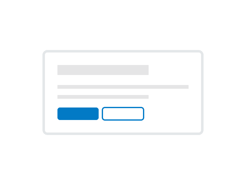
Do
Have a clear call to action when including Buttons. Avoid including more than one primary and one secondary button.

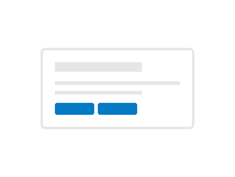
Don't
Don’t put multiple primary actions in a Card

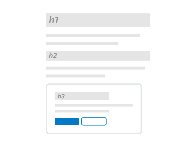
Do
Use a Heading in your Card that appropriately reflects the information architecture of the page.

Don't
Don’t use Cards to highlight multiple primary actions on a single page.
Do
Use a Heading to set a clear expectation on the Card’s purpose.
Don't
Don’t place multiple Heading components in a single Card.
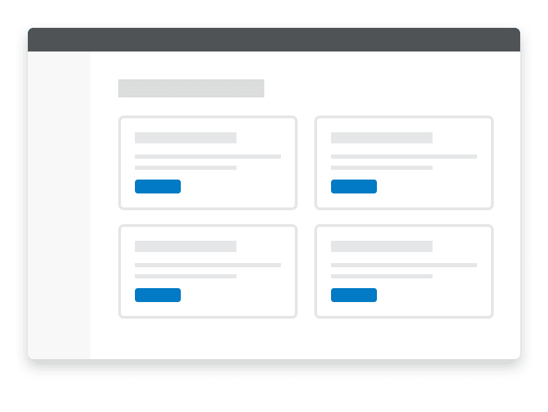
Do
Use a consistent location on the bottom of the Card for primary actions or next steps.