Notification and feedback patterns
The Notifications and Feedback pattern communicates timely and intentional information to the user.
Each notification or feedback pattern uses one or more of these components.
// import all components for Notification and feedback patterns
import { Alert } from "@twilio-paste/core/alert;
import { Toast } from "@twilio-paste/core/toast";
import { Label } from "@twilio-paste/core/label";
import { Input } from "@twilio-paste/core/input";
import { HelpText } from "@twilio-paste/core/help-text;
import { Button } from "@twilio-paste/core/button";
import { Modal, ModalBody, ModalFooter, ModalFooterActions, ModalHeader, ModalHeading } from "@twilio-paste/core/modal";
import { Card } from "@twilio-paste/core/card";
import { Heading } from "@twilio-paste/core/heading";
import { Paragraph } from "@twilio-paste/core/paragraph;
Pairing thoughtful content writing with the appropriate UI elements can help you establish trust with customers by notifying them of relevant information at just the right time. Use these patterns only when the user needs to be notified.
In general, notifications should close when a user leaves the page. A notification should follow a user through the product only in the most critical cases, like an alert informing a customer that their paid account won’t renew soon because of expired billing information.
Too many notifications that appear for too long may lead to alert fatigue, causing users to ignore important information.
There are 3 levels of notifications and feedback:
- System-initiated notifications: Information that’s not triggered by a user action and is related to system issues.
- Feedback indicators: Acknowledgment of a user action, like submitting a form or pressing a “Copy code” button.
- Notification centers and reminders: Currently, these are highly specific to products’ business needs and should be treated as a product feature, rather than a pattern. While the implementation of a notification center might use Paste components, guidelines specific to a notification center won’t be covered in this page.
Notifications in high-emotion or high-stress situations
For high-emotion or high-stress parts of the customer journey, use a component that appropriately matches the customer's level of emotion. For example, to confirm that a customer has successfully upgraded their account, you may want to use a full-page confirmation that celebrates the moment, instead of a simple toast.
Notifications and feedback can come in 4 variants:
- Success: Confirms a successful or completed action.
- Error: Communicates critical information that's actively preventing a user from continuing a flow.
- Warning: Communicates critical information that will help a user avoid a potential issue, but won’t prevent them from continuing their immediate goal.
- Neutral: Informs a user of general changes, or processes that have been triggered by a user action but will take time to finish.
Give users enough time to read a notification message, make a decision, and act on their decision. Users’ reading speeds, vision levels, literacy levels, dexterity, and familiarity with Twilio products can all affect how much time they’ll need to interact with a notification.
Visit the Alert, Modal, Form element, and Toast pages for more specific guidelines on how to implement each component accessibly.
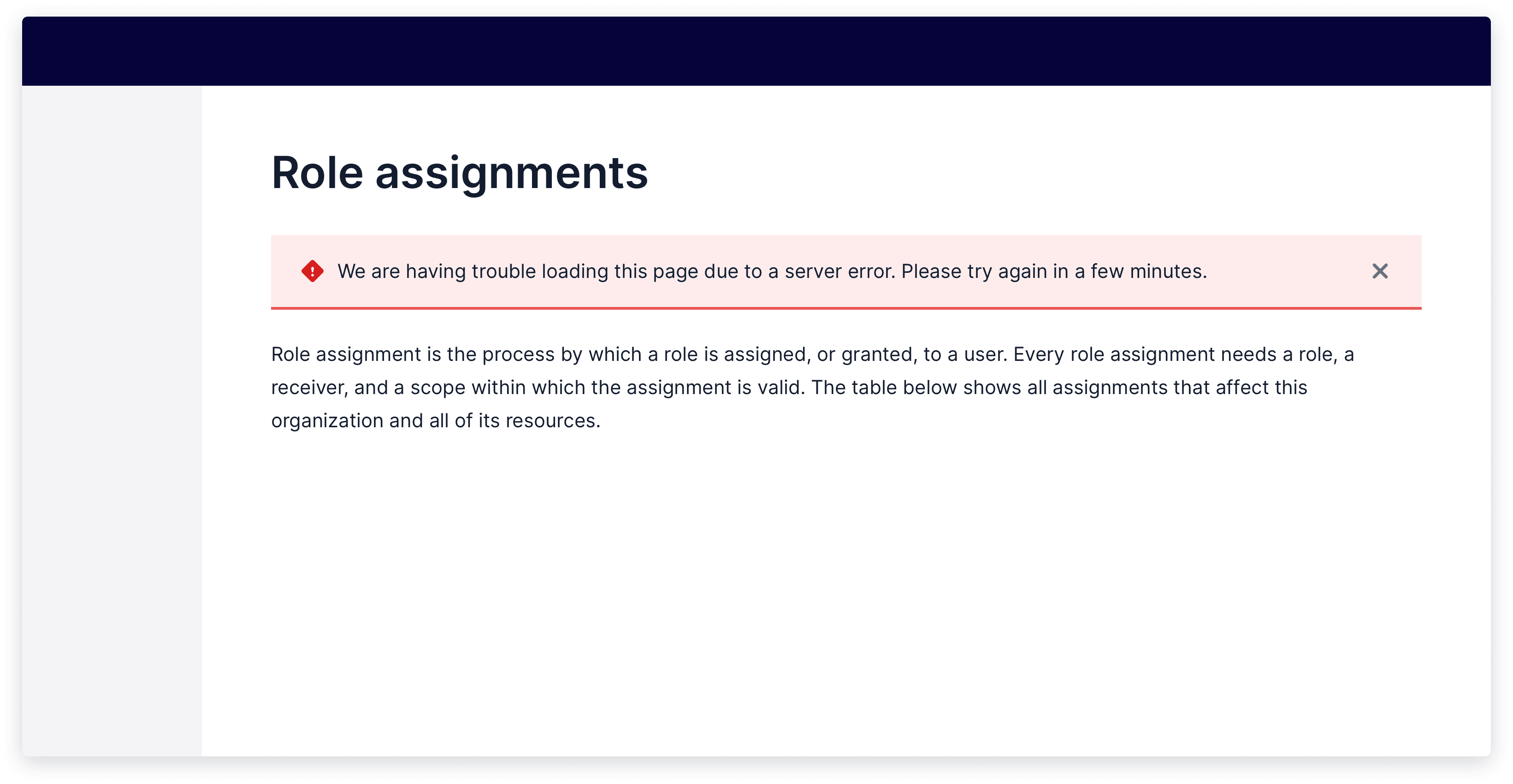
To communicate information from the system that isn't triggered by a user action, use an alert, especially for high-priority or time-sensitive changes to the system.
Show live example
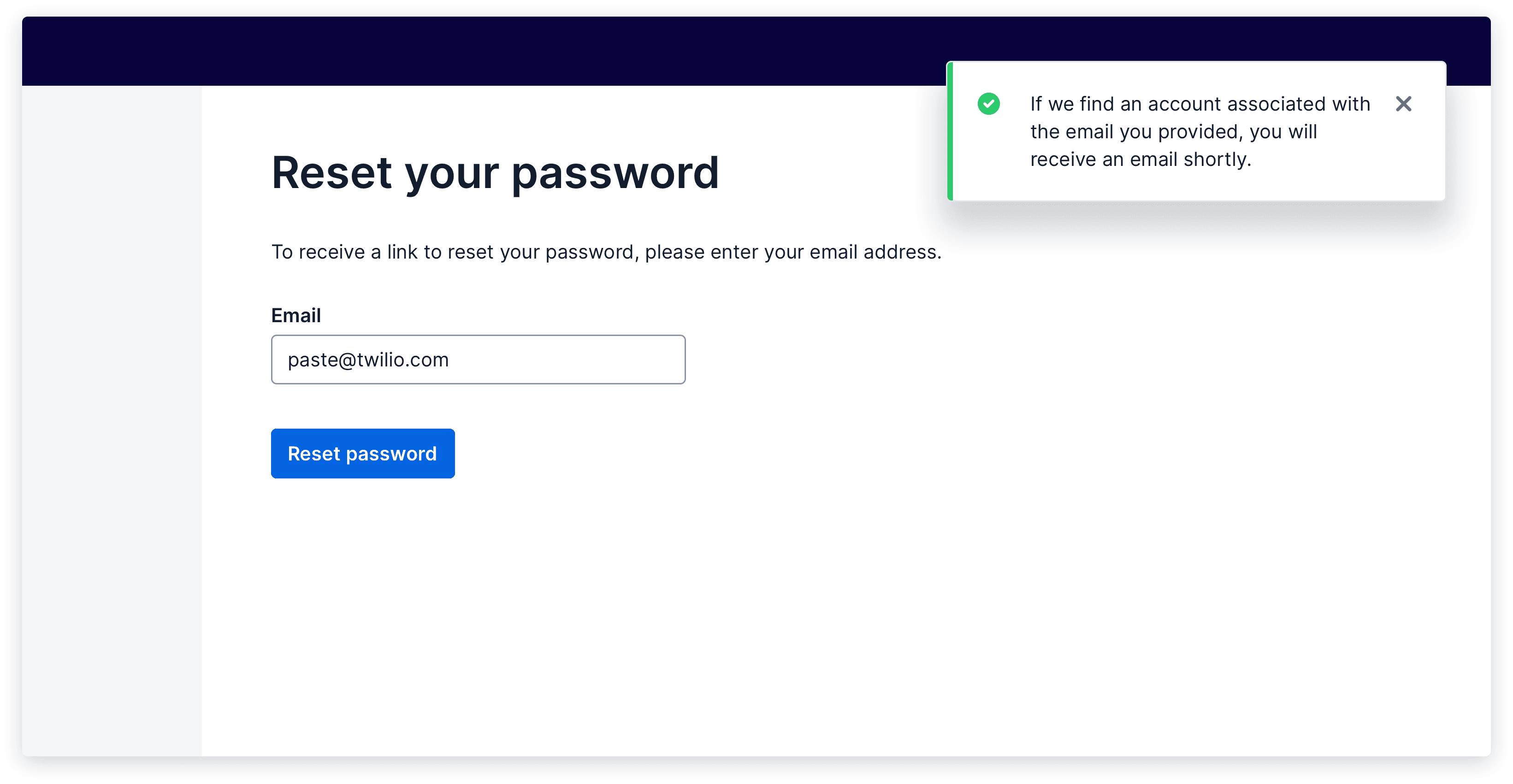
To communicate feedback on a user action, use a toast, modal, inline messaging, and/or in-page messaging (e.g., full-page confirmation).
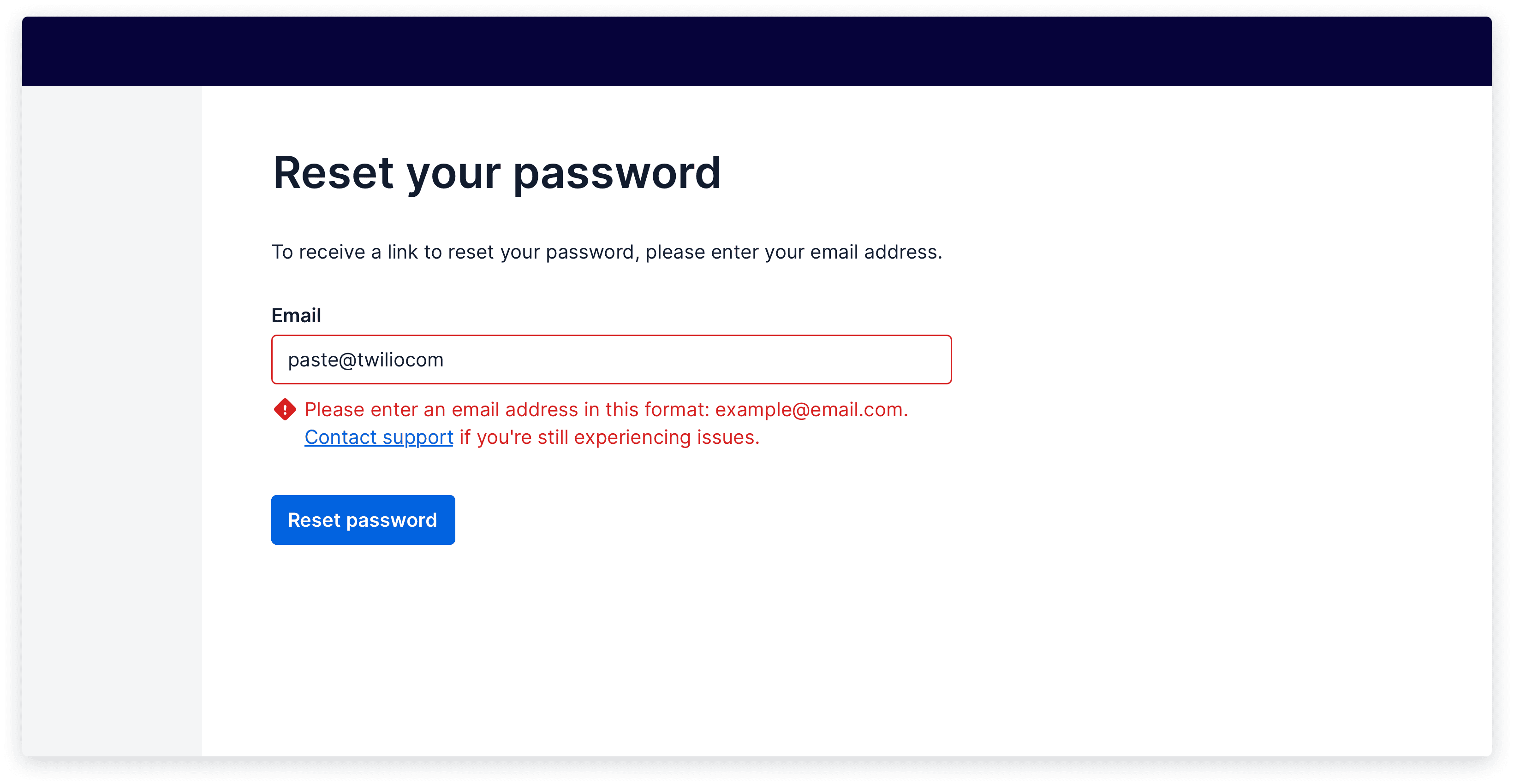
While you’ll only need one type of feedback indicator in most cases, pairing 2 feedback indicators can help give users more clarity in completing a complex flow. For example, when a user submits a long form with errors, you can show an error toast that lets users know they need to fix a form, while also showing inline errors on each incorrect field.
Use a Toast when
- You’re communicating a direct response to a user action. Example: "asset.jpg" successfully added.
- You're providing only one link or button to help a user continue a flow.
- There’s no other way for a user to immediately know that their action was acknowledged. For example, a Toast may not be needed when a modal closes after a user presses “Save” in it. The modal dismissal may sufficiently communicate that the information in the modal was saved, without needing further messaging.
Toasts in Flex and SendGrid?
While the recommendation is to migrate to Paste Toast components to acknowledge user actions, Flex and SendGrid currently use banners for this purpose.
These banners generally exist at the top of the page, especially for page-level actions, with a limit of 3 per page. The oldest one is removed when a new one displays. In Flex, banners may be placed at the top of a specific section where the action was taken.
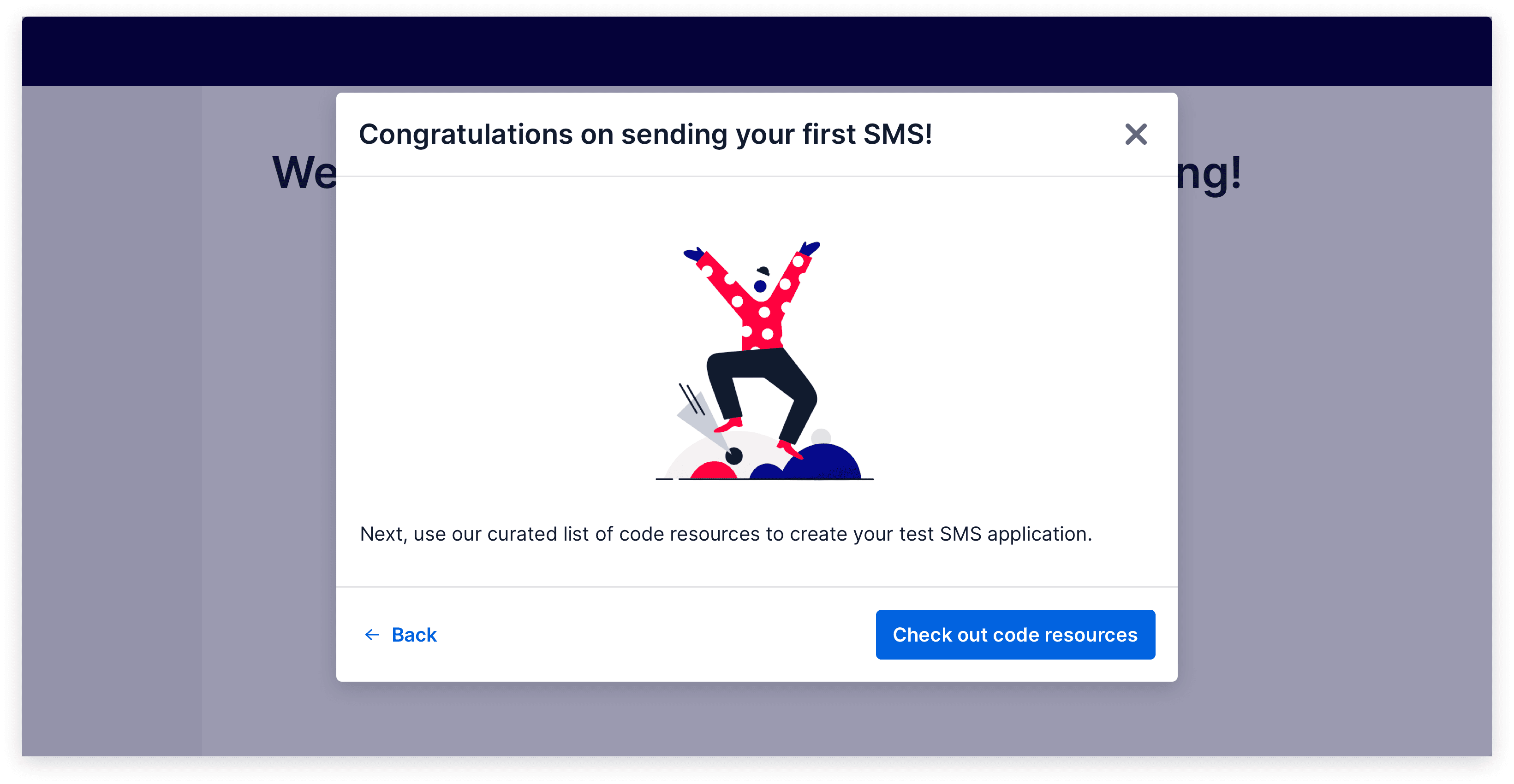
Use a Modal when
- You’re interrupting a user flow.
- You’re focusing a user’s attention and confirming a definitive action at the end of a Modal flow.
- You’re providing lengthy text, multiple links, or multiple buttons to help a user continue a flow.
Show live example
Use contextual, inline messaging (e.g., inline errors on form fields) when
- You’re communicating a direct response to a user action.
- You’re providing links or buttons that are contextual to a UI element and help a user continue a flow.
- You’re communicating dynamically changing content, like a progress bar.
Show live example
Use in-page messaging (e.g., full-page confirmation composition) when
- You’re communicating a direct response to a high-emotion user action or flow.
- You’re providing information that a user might want to copy, screenshot, or save, like a confirmation number or invoice details.
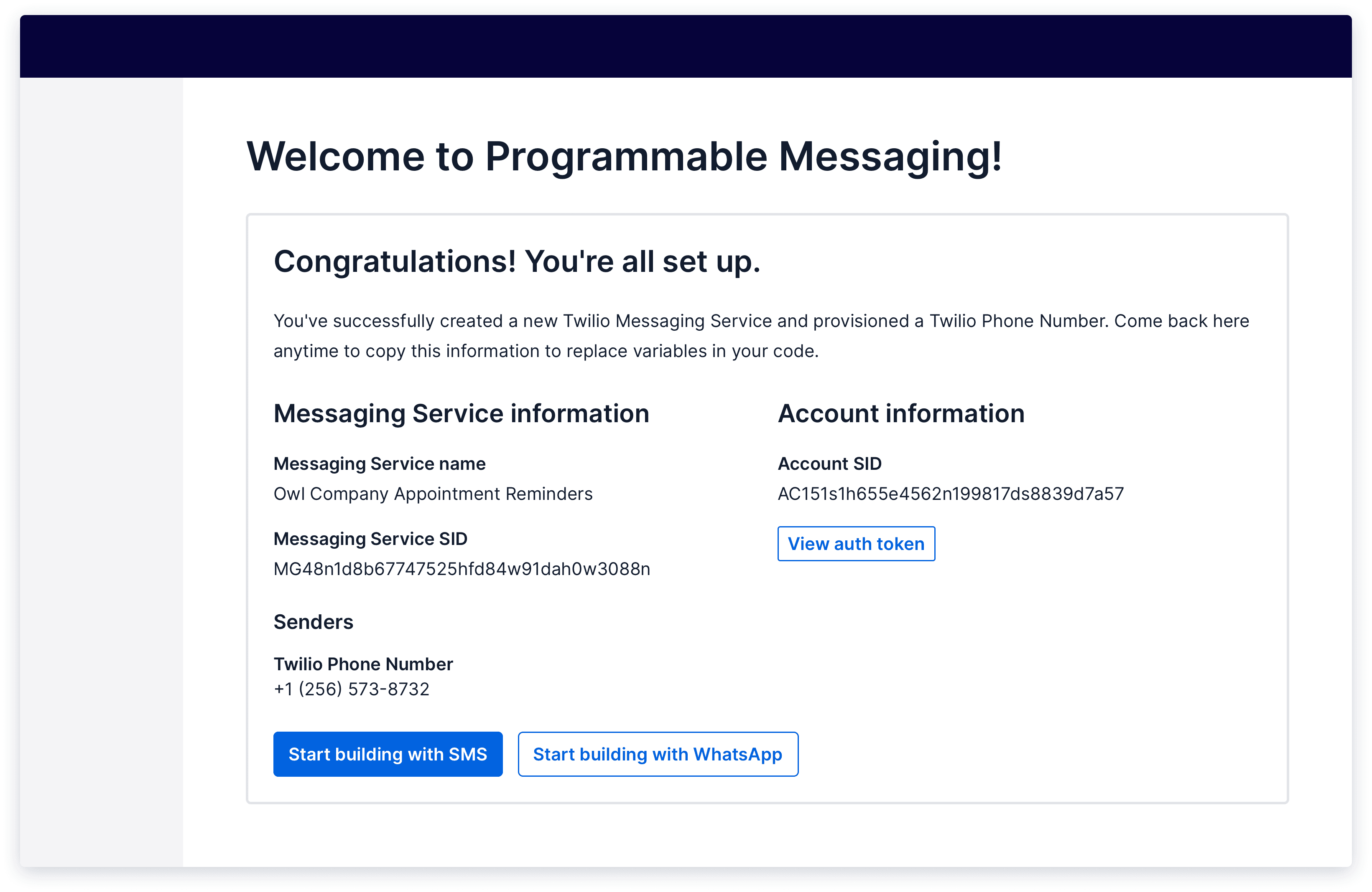
Show live example
Coming soon
Coming soon